OtterBox B&W Collection
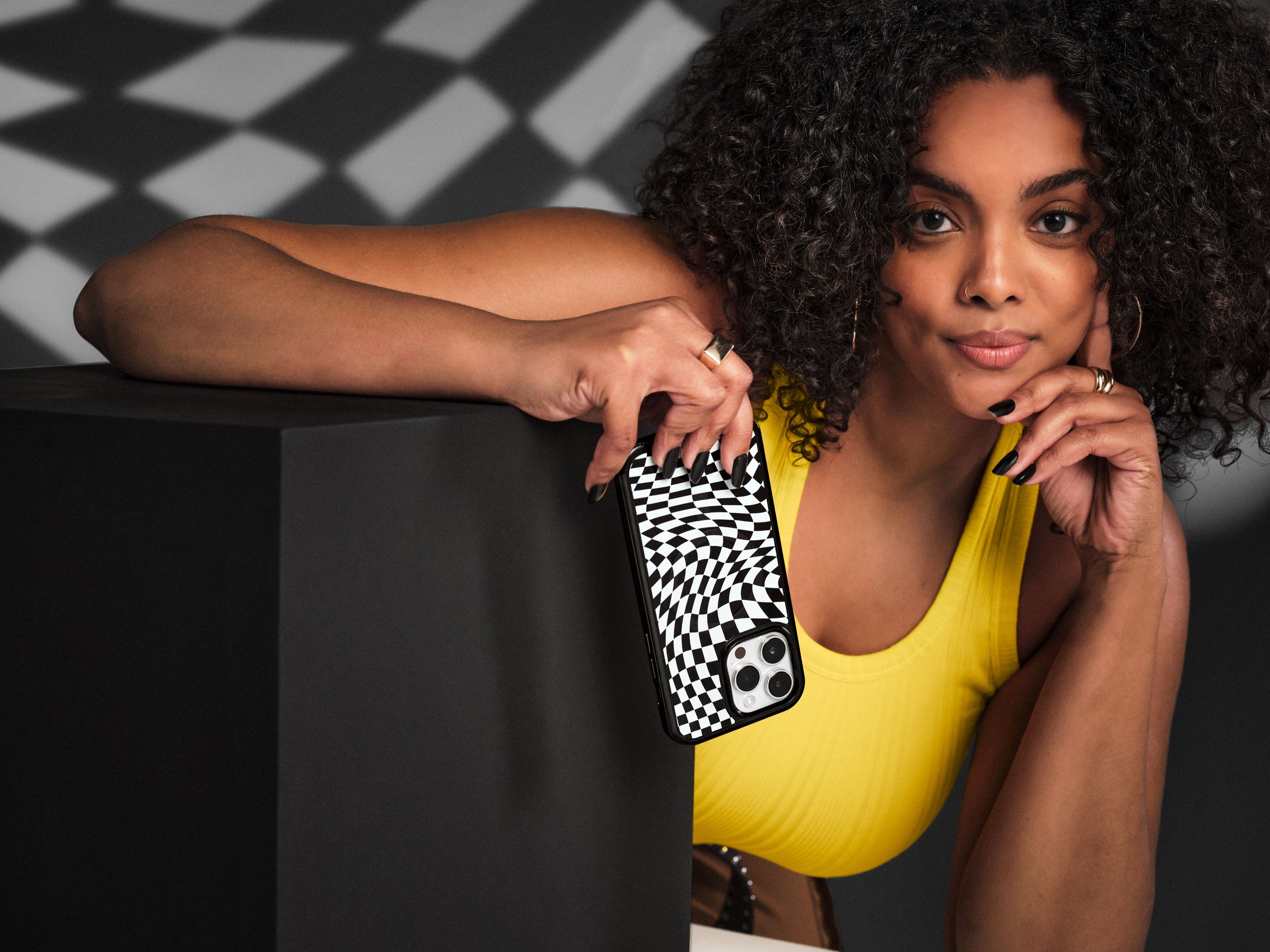
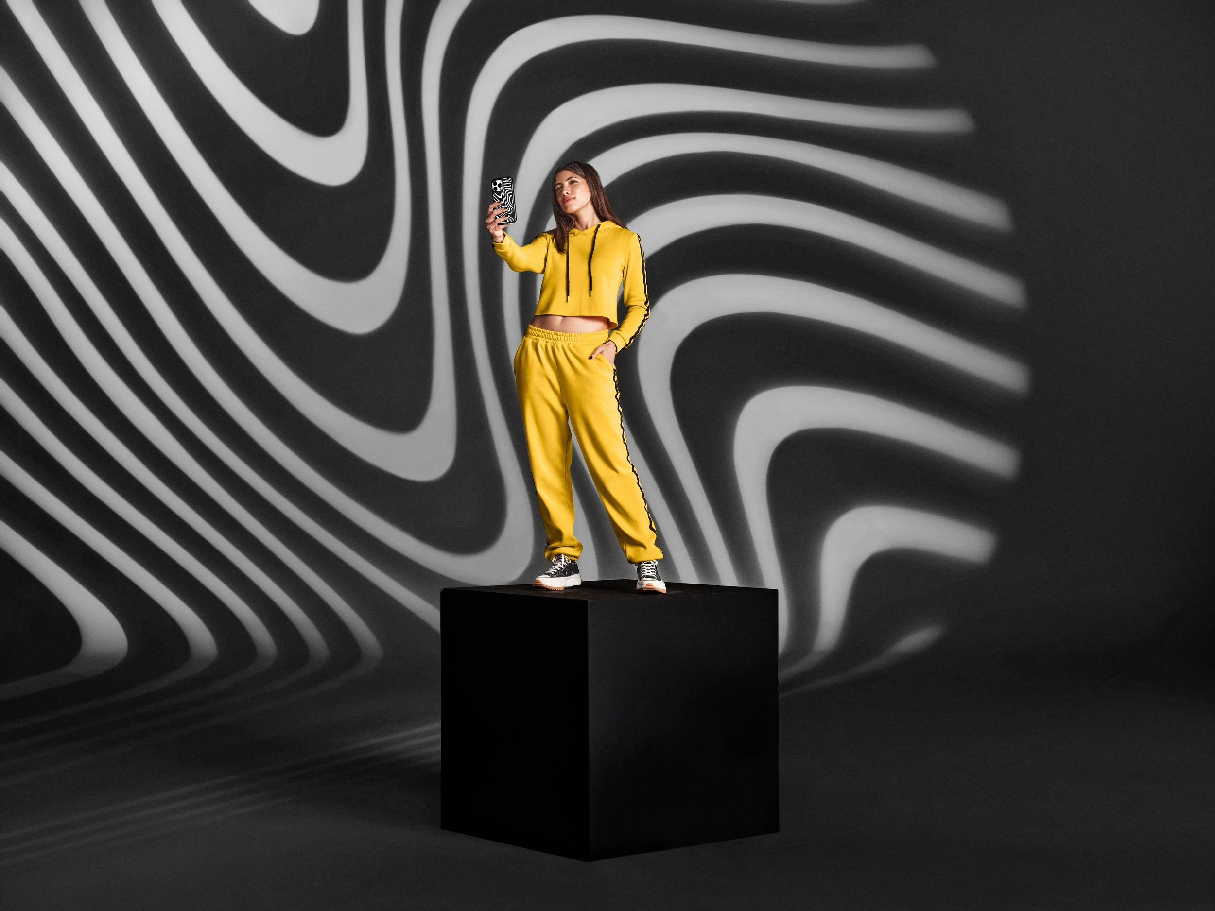
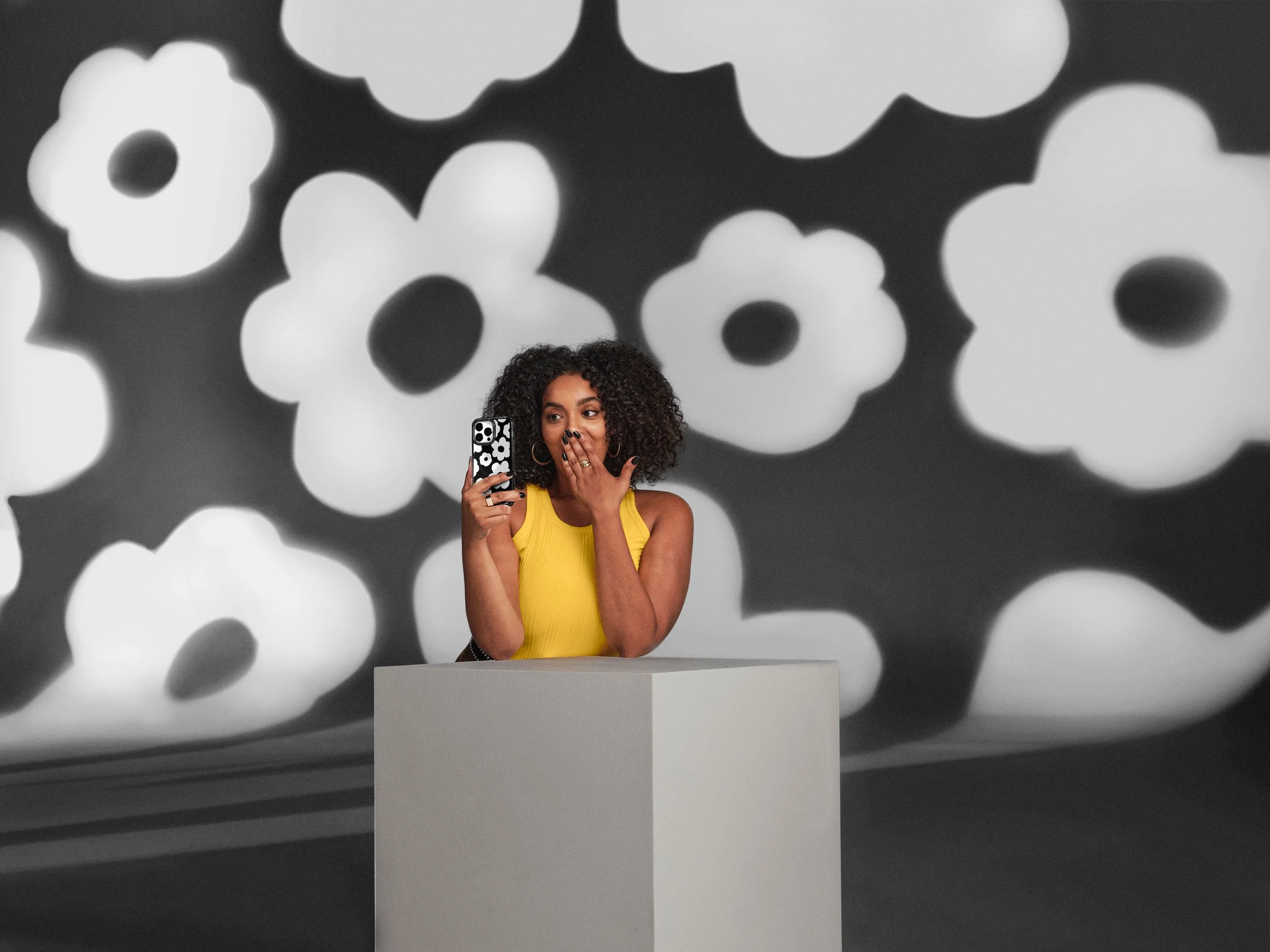
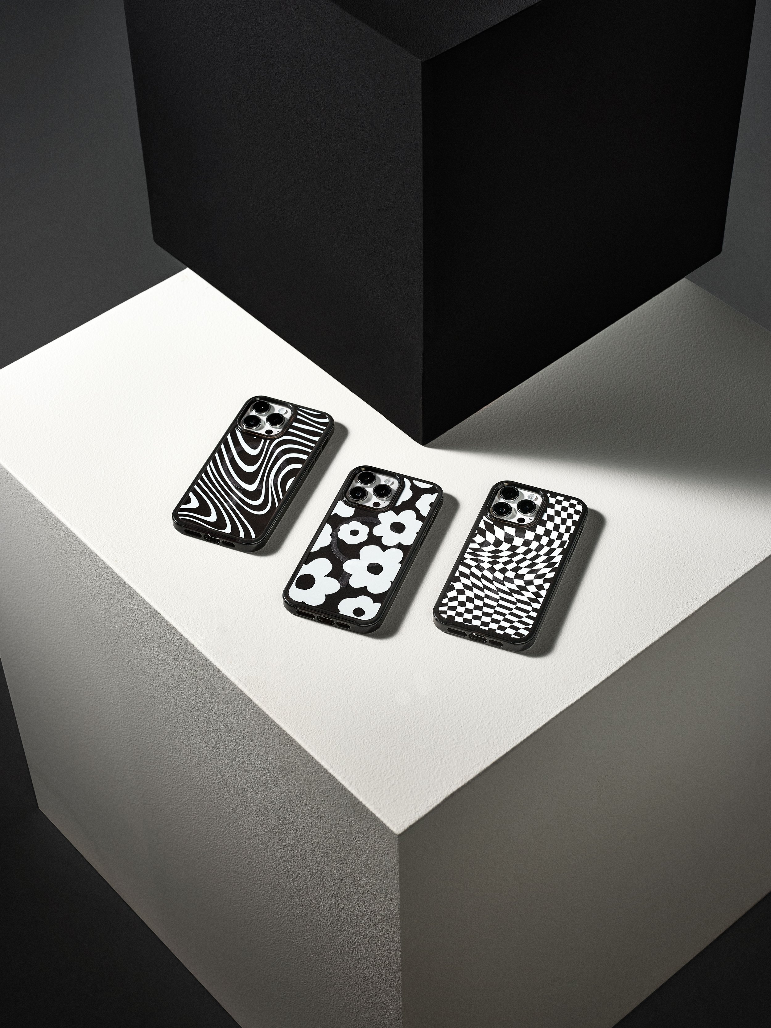
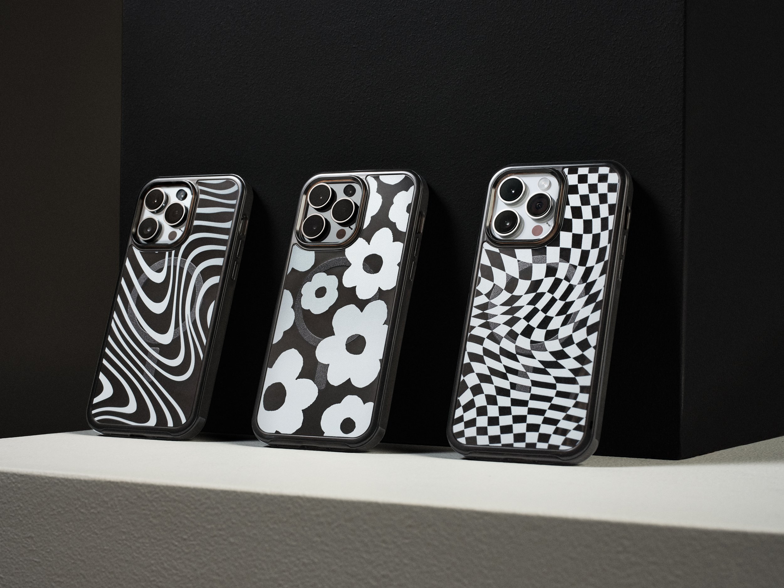
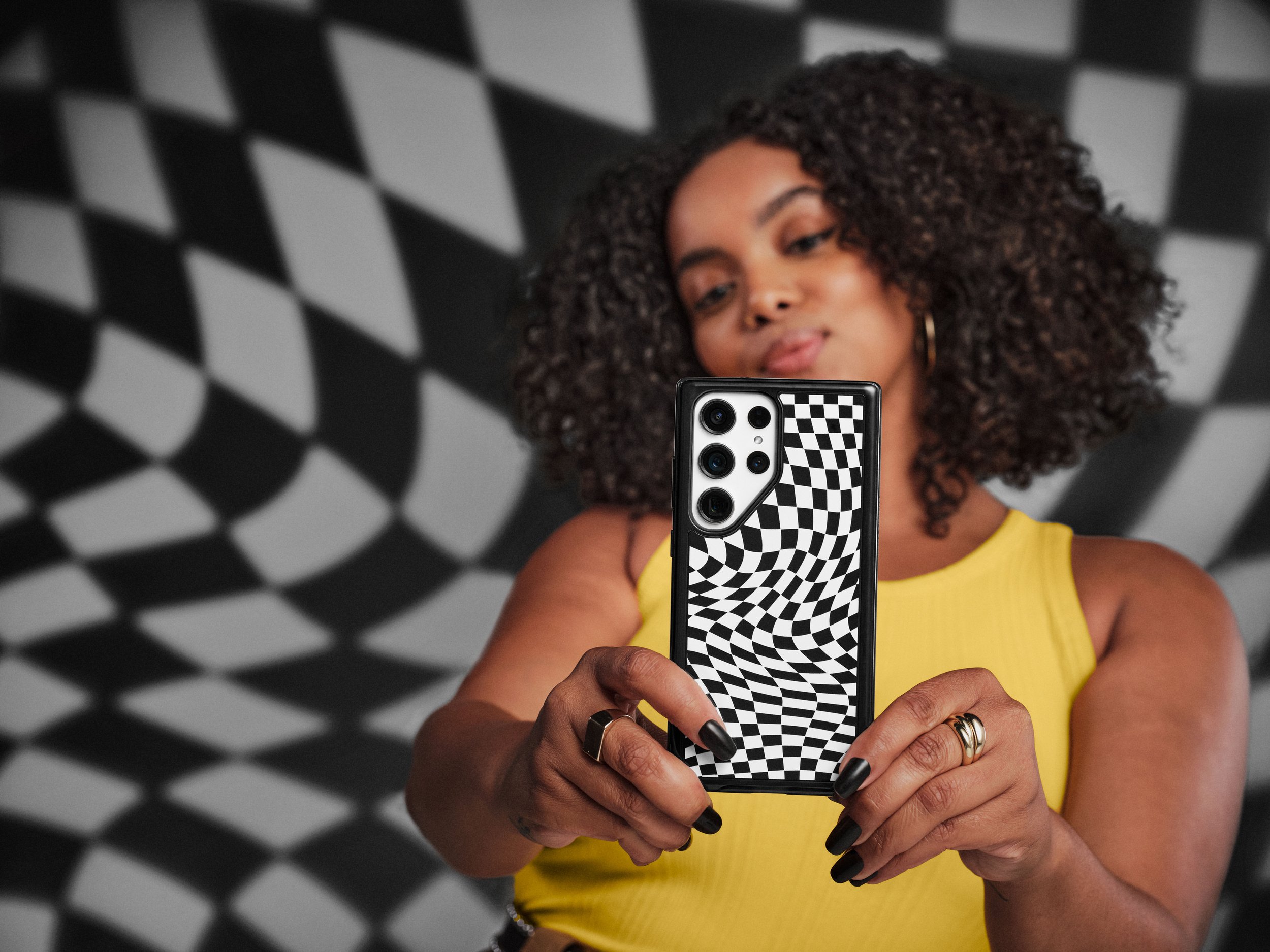
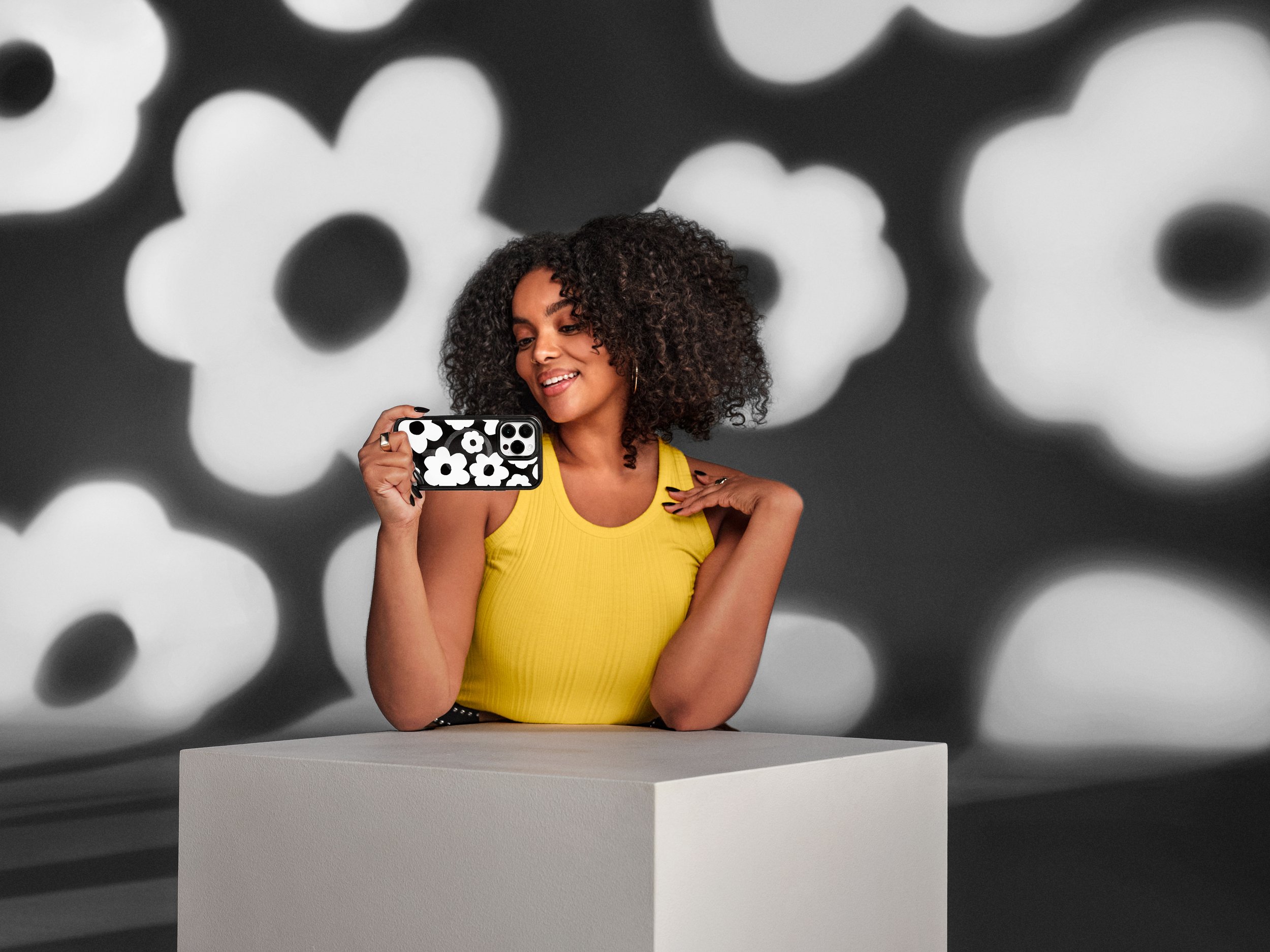
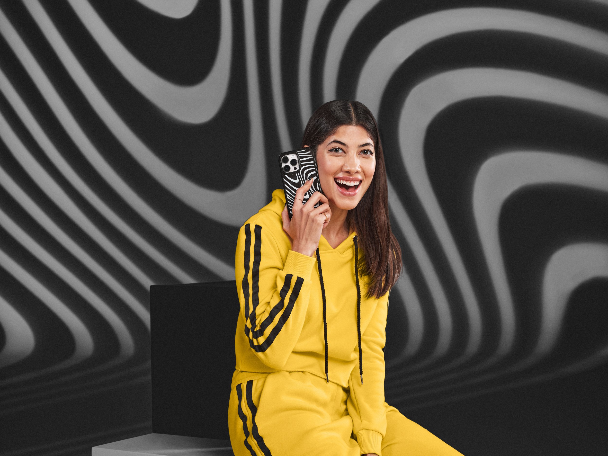
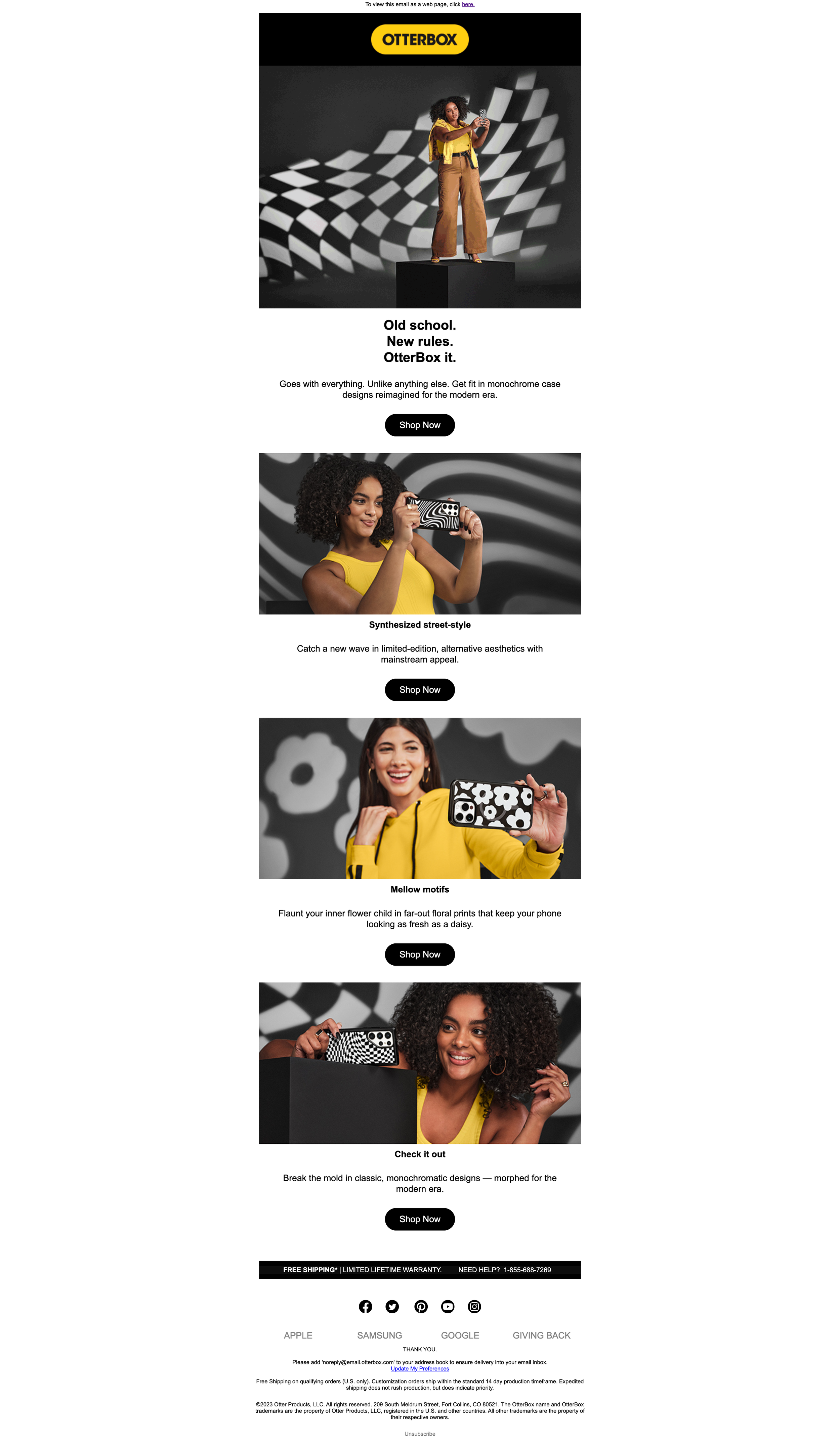
OtterBox had a limited-run case line in the pipeline, and our team was tasked with developing bespoke assets to support the launch. The cases in question had a ‘90s-psychadelic throwback vibe and a monochromatic color palette. For the shoot, we designed the set in blacks and whites while casting the case patterns onto the background. For wardrobe, we added touches of yellow in a nod to our primary brand color. And in post, the art and copy coalesced under the look and feel of our OtterBox it campaign.
Roles: Associate Creative Director, Senior Copywriter
Art Director: Wallis Osborn / Creative Director: Michael Kirby

Produce it.
To support the launch of this limited-run case line under the OtterBox it campaign umbrella, we produced a set of distinctly monochromatic assets. The set design paired white and black surfaces with two-tone projections of the case patterns. We brought back the box stage prop for continuity. And for a pop of brand color, we dressed the talent in yellow.




Deliver it.
Before the collection became available, we launched a teaser banner on otterbox.com to build interest and anticipation. On launch day, we showed up with consistent art and copy across our own owned channels and through paid media.
Move it.
Although the production budget only allowed for photography, we still needed to create video-like-objects to support YouTube pre-roll and social placements. Here’s one example of how the design team used montage to build motion into our stills.